
The Wow Factor: Use of Color in Event Design
The use of color in event design has a big impact on its success. This is because color affects the way people behave, perceive and react in situations. From brands we support to the paint we select for walls, each color stimulates a reaction in the brain.
Color theory and psychology are commonly used to manipulate our decision making. Marketing is notorious for this tactic, but the use of color in spaces also influences our behavior and moods. For this reason color should carefully be considered when planning your next corporate event.
We’ve broken down some basic color theory and what it says about human behavior.
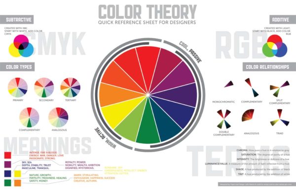
THE COLOR WHEEL
The color wheel is a circular diagram that defines relationships between colors. It was created by Sir Isaac Newton in 1666. There are 12 main colors on the color wheel. These colors are divided into three groups: primary, secondary and tertiary.
There are warm tones, cool tones, shades, tints, hues, saturation, luminance, and schemes. Color is pretty intense…pun intended. All of these elements result in color harmony – the visual impact on our brains.
COLOR MEANING
Incorporating color in event design creates a sense of interest and visual order. If a hue does not match the design intent, it can cause anxiety or boredom. Introducing color based on its psychological impact creates balance and comfort.
At large corporate events, typically guests are instantly bathed in light and color. This immediately evokes an emotional response. Are you getting it right?
There are obvious correlations, like red with love and blue with calm. But, what about orange? Did you know it can stimulate your appetite? Yellow is traditionally associated with happiness but can cause anxiety if it’s overused. Take a look at some of the emotional response color can trigger.
- RED
Passion, energy, love, power, heat, danger - ORANGE
Courage, confidence, friendliness, hunger - YELLOW
Happiness, warmth intelligence, anxiety - GREEN
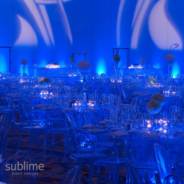
Environment, money, healing, envy - BLUE
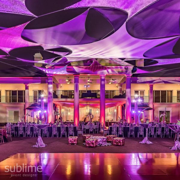
Security, tranquility, loyalty, cold, fear - PURPLE
Royalty, wealth, luxury, ambition, moodiness - WHITE
Innocence, purity, clean, isolation
COLOR SCHEMES
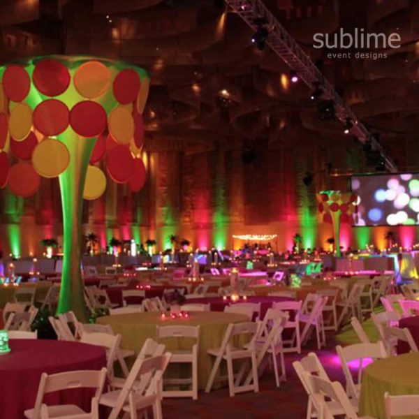
When planning your event, it is important to identify the scheme and understand the visual balance it offers. Combining colors in interesting ways can offer your event an incredible wow factor, but understanding the trigger will allow you to pull it off in a successful way.
Analogous Schemes
These colors sit directly next to each other in the color wheel and create soft and smooth blends. For example, blue, turquoise and violet are analogous colors and work well for professional and subdued events. They evoke tranquility and peace and generally pleasing to all personalities.
Triadic Schemes
Triadic are three opposite colors on the wheel and are often challenging to pull off in event design as they can be overpowering. There are situations where loud and intense hues work, like Mardi Gras. This triad of yellow, purple and green are unlikely companions in the natural color world but work beautifully when pulling off the New Orleans vibe: loud, rambunctious and intense.
Monochromatic schemes
Exactly what the name implies, monochromatic events use various shades of one specific hue. Incredibly simple and easy to achieve, one-color events can be very powerful in their delivery and easily translate your mood. White parties are a popular monochromatic scheme delivering clean and simple affair.
Complimentary and Split complimentary schemes
This scheme uses two (or three) direct opposite colors on the color wheel. It’s bold and high contrast but has an incredible visual effect. Sports themed parties are great for complimentary schemes; in fact, most sports teams use these palettes in their brands. Blue and orange are examples of complementary colors. If you stare at something blue for 30 seconds or longer and then look at something white, you will see the complementary color in its place – orange! Try it!
Exercise caution when using complementary colors, especially red and green, as this can be overwhelming and confusing to those who are color blind.
As you can see, there are many things to consider when weighing your use of color in event design. All details are an opportunity to translate your vibe – linens, lighting, props, and even food and drinks. Above all, make sure it feels right to both you and your guests.
Need help identifying the right hue for your next event? Contact us today!